App redesign
ProofHub
UI/UX Case Study
Project Management App
Figma
Overview
What
ProofHub is a project and team collaboration software. Their aim is to help companies save time, stay focused and have an increased productivity rate. Their core product is a web-based app which allows for customisation to enhance the team’s experience and meet their unique needs.
My Role
Solo Project
Timeline
4 weeks
Why
User Personas
To understand the system completely I sat down with 15 individuals who’ve been using ProofHub for varying amounts of time, and from different age groups.
Shreya | 28
Been using the app for 2 years
Tech Savvy
& quick to adapt
Needs
To check notes before a meeting
To keep track of amount of time spent per project
To see who shares tasks with her
Challenges
App sends me too many notifications on my email
Too many unused and cluttered features
App is not intuitive - features are hard to find sometimes
Manoj | 46
Dislikes the app - prefers the laptop
Manager - has
to ensure team
tasksare on track
Needs
To keep track of tasks to do
To ensure that all team members are on track
To give clients “time sheets”
To keep notes from previous meetings handy
Challenges
Theres too many things happening at once on the app
No easy connect between the app and desktop
Can’t move things around on the app according to needs
Search is not very intuitive
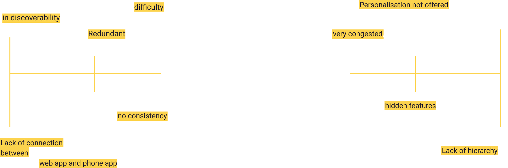
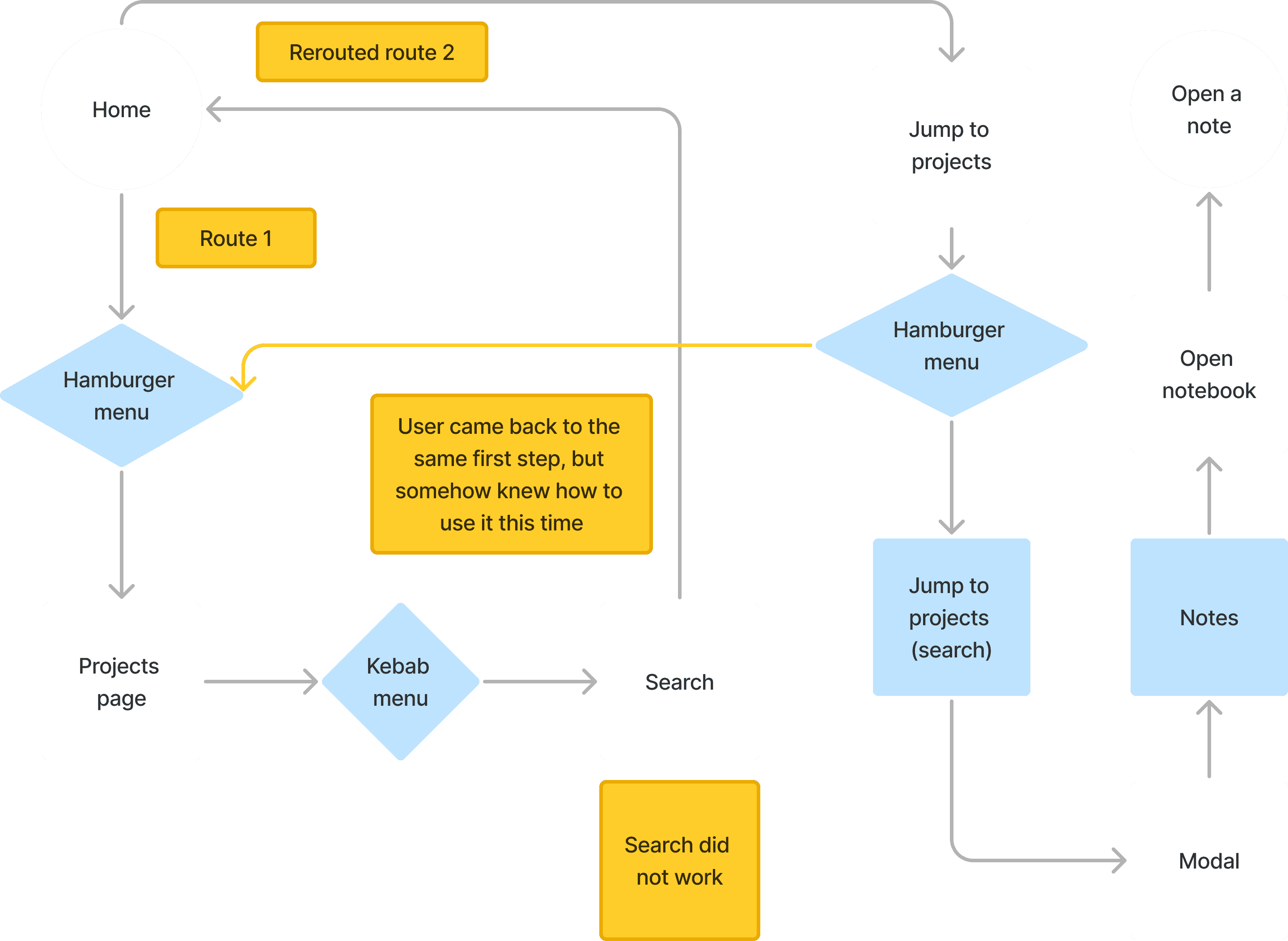
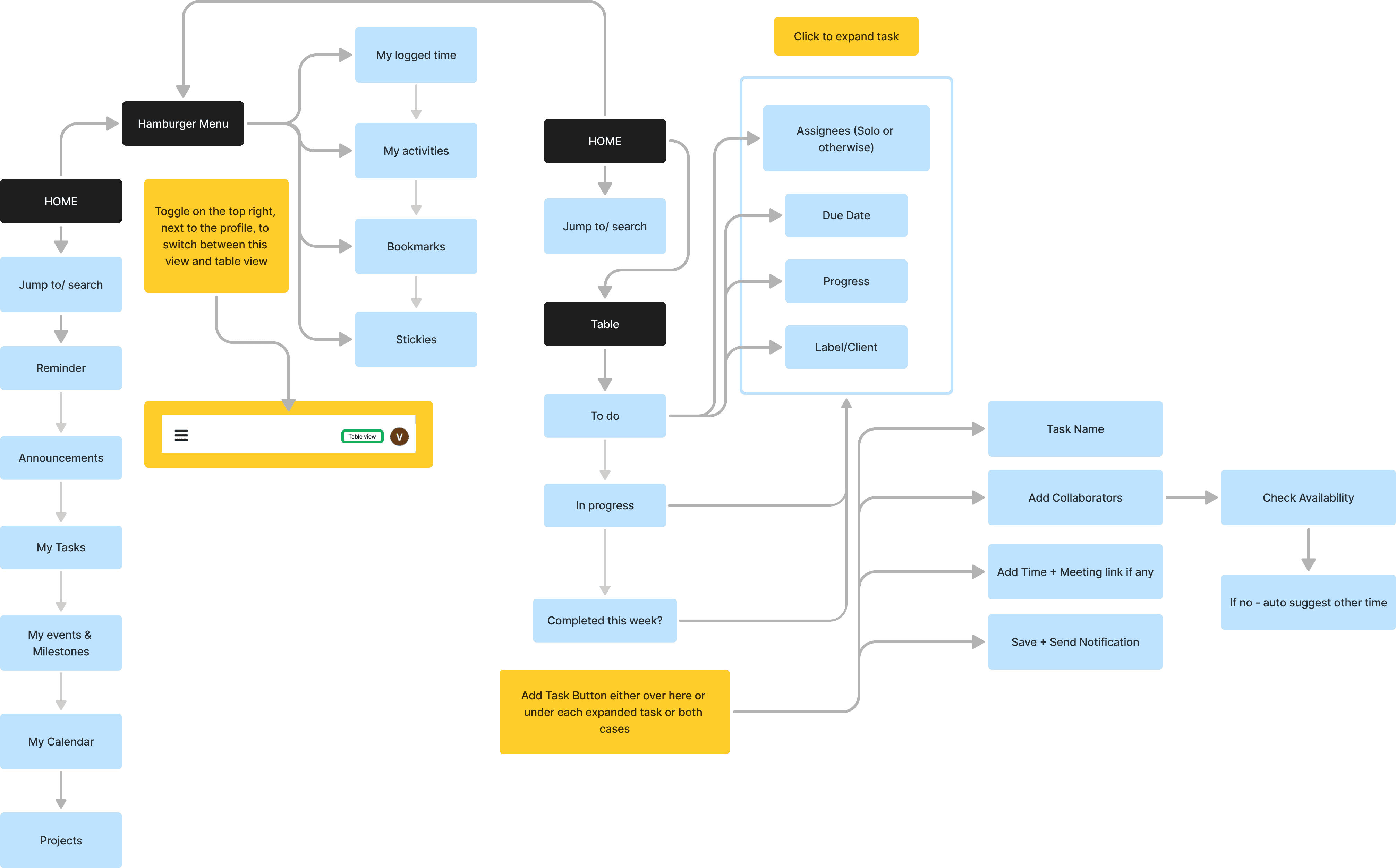
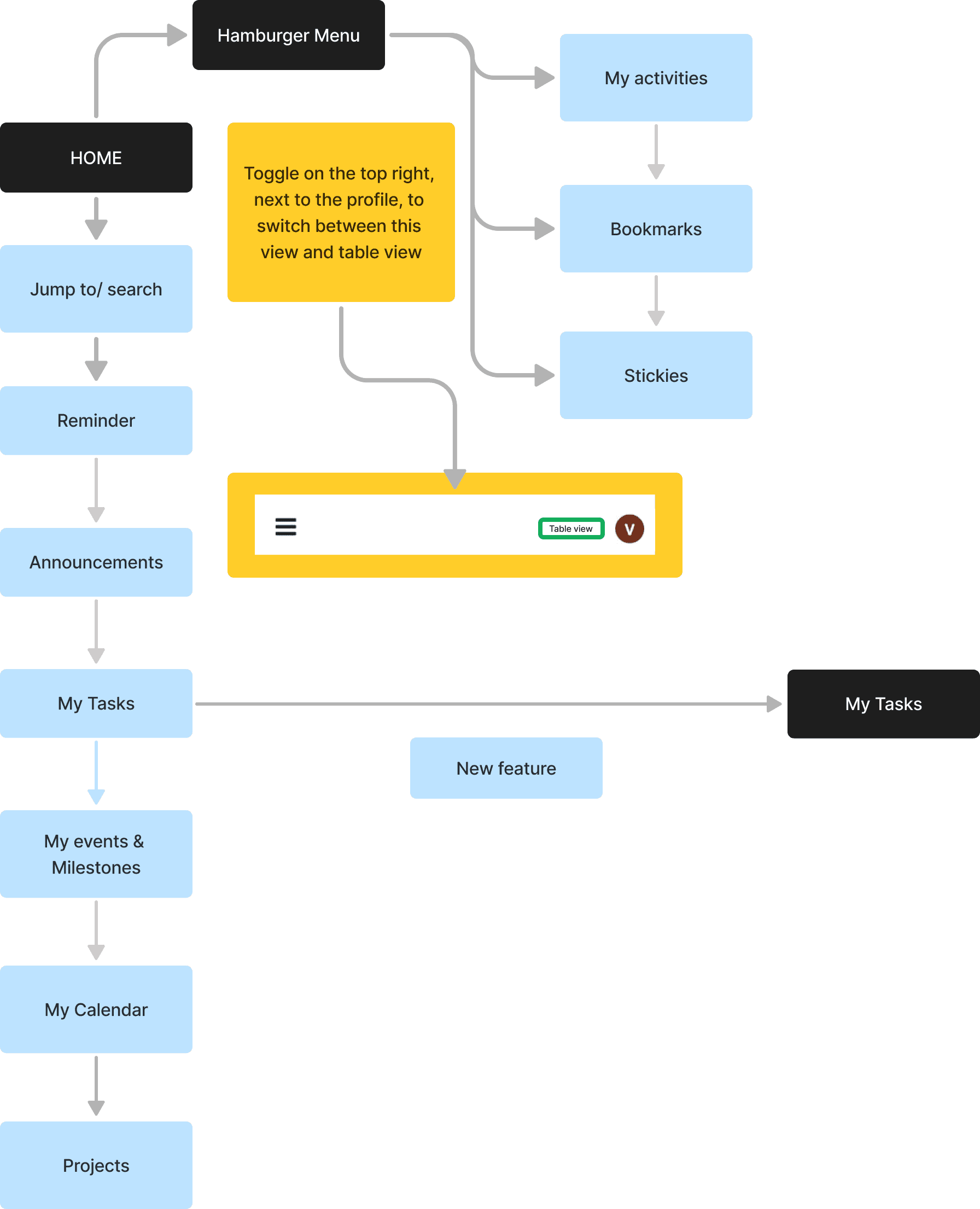
Complex User Journey
While talking with users I discovered the pathways they were following, below is the most complex one that multiple users were going through
Competitor Analysis

A new toggle option for optimised use!
A Task Stack - inspired by Slackk and Bumble !!
Creating a Design System
With multiple pain points across screens, and the main one being the overall design language, that became my starting point.
Ab
Roboto
Regular | Light
20px
The quick brown fox jumps over the lazy dog.
16px
The quick brown fox jumps over the lazy dog.
16px
The quick brown fox jumps over the lazy dog.
12px
The quick brown fox jumps over the lazy dog.
10px
The quick brown fox jumps over the lazy dog.
8px
The quick brown fox jumps over the lazy dog.
Primary colour palette
Component colour palette

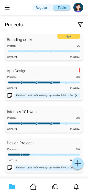
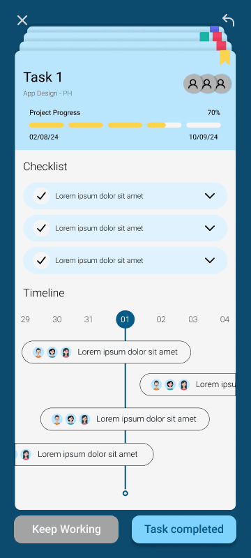
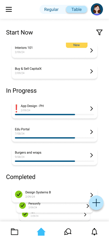
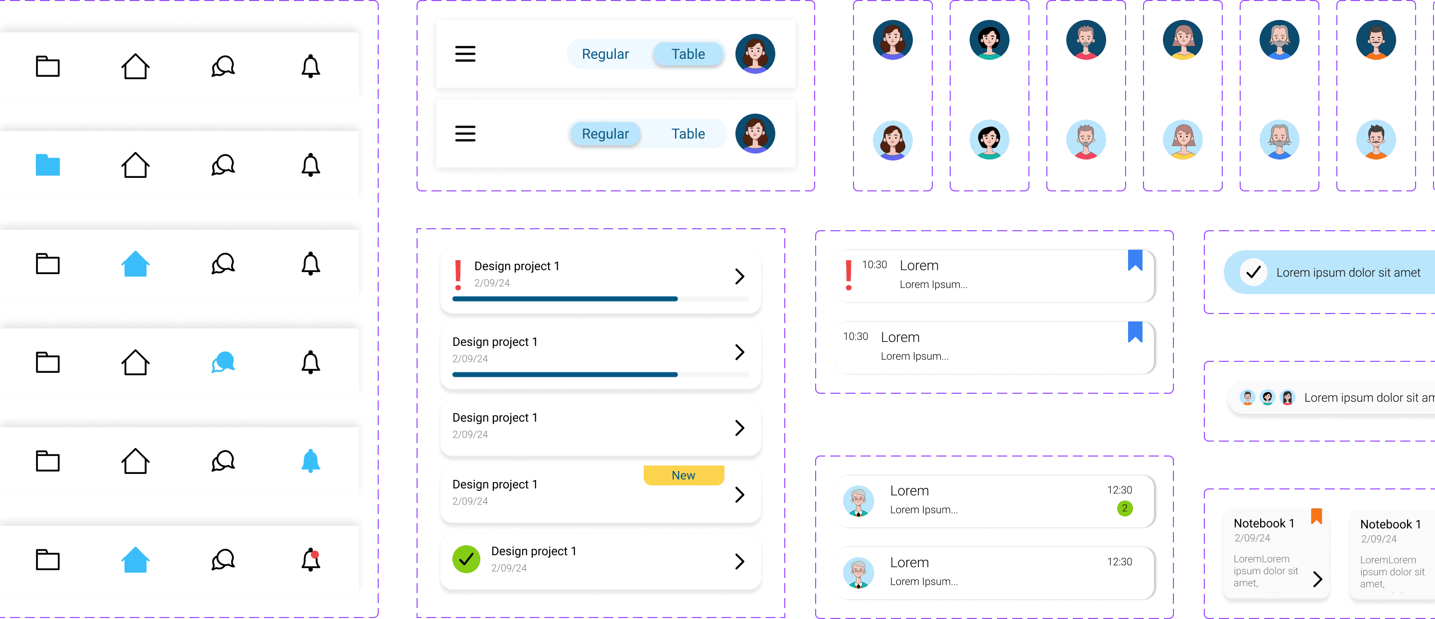
Before | After
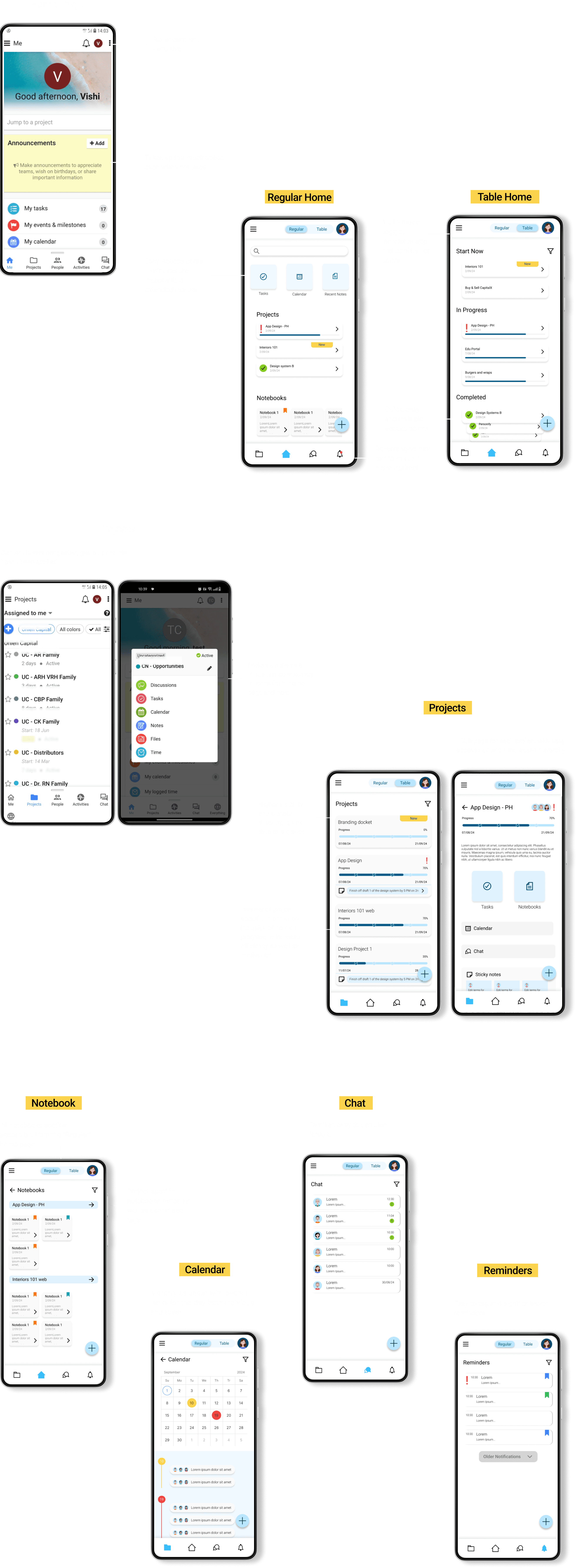
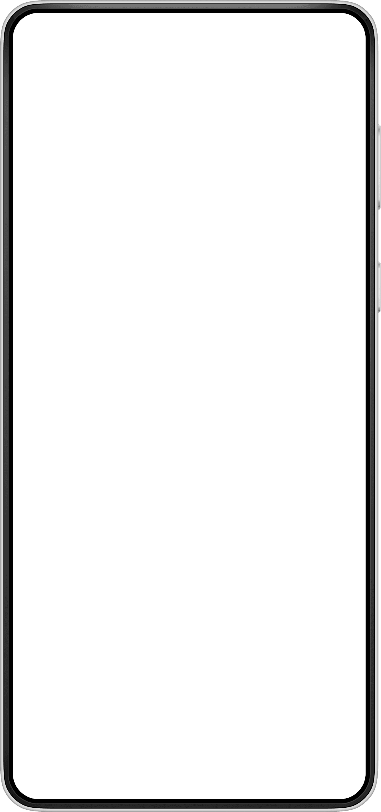
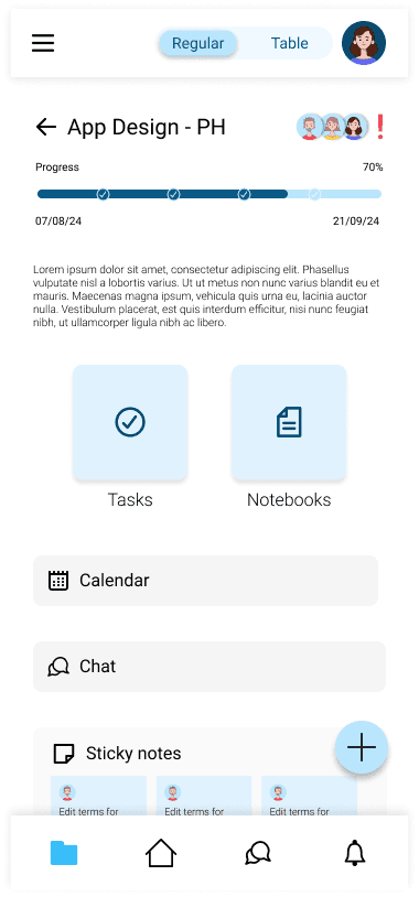
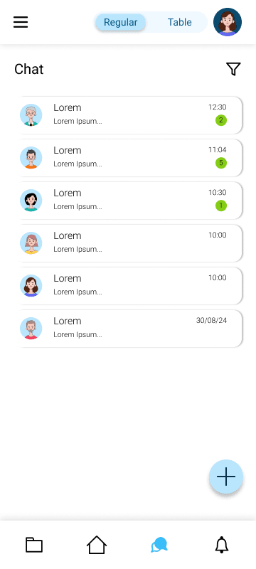
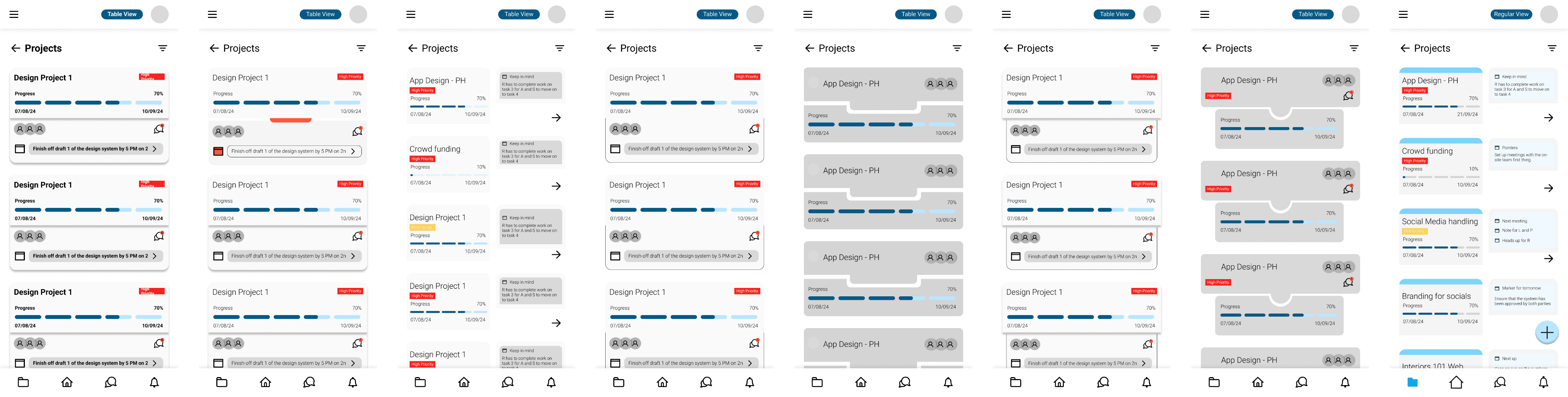
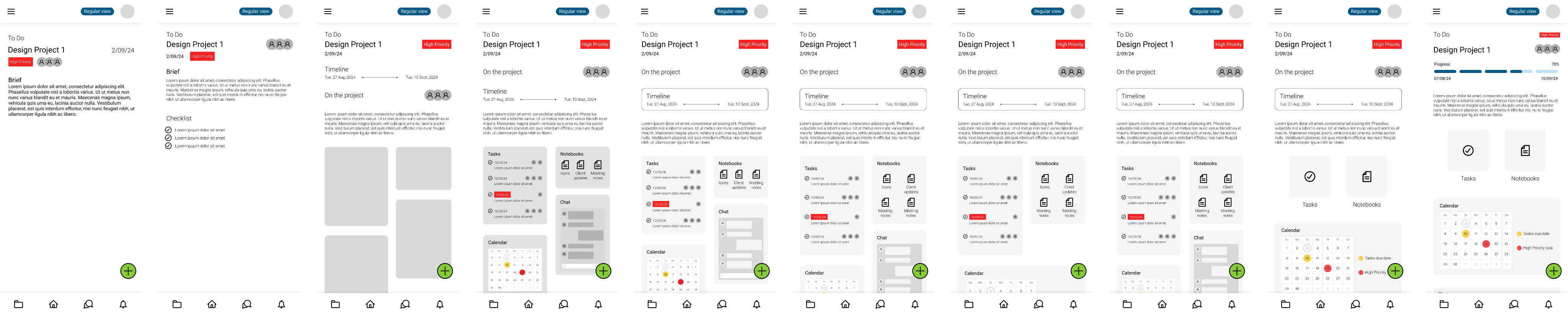
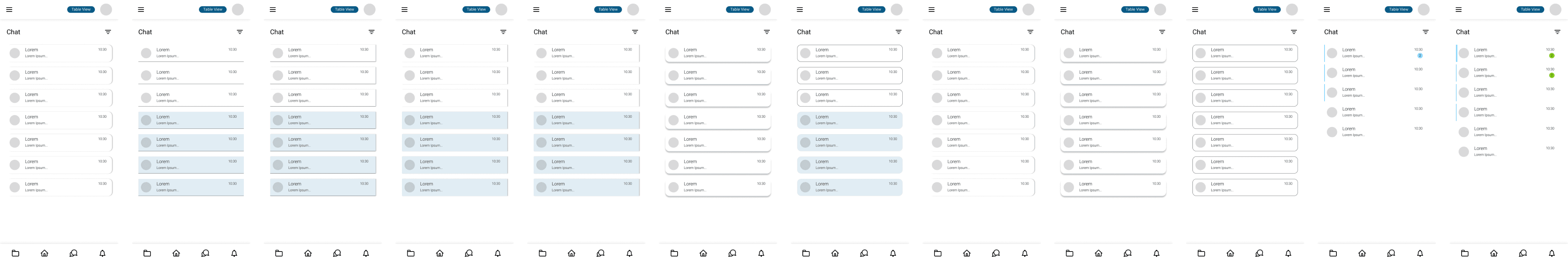
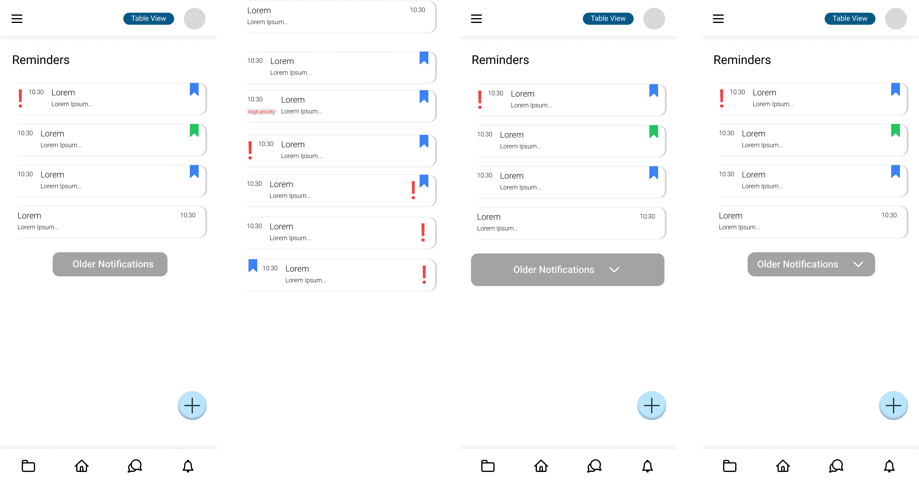
Trial > Error > More Trial > ProofHub Revamped!
The aim at this stage became to ensure that content was - easy to discover, customisable, did not need a steep learning curve, and the app overall had a clean, easy on the eyes type of design.
Iterations
Now
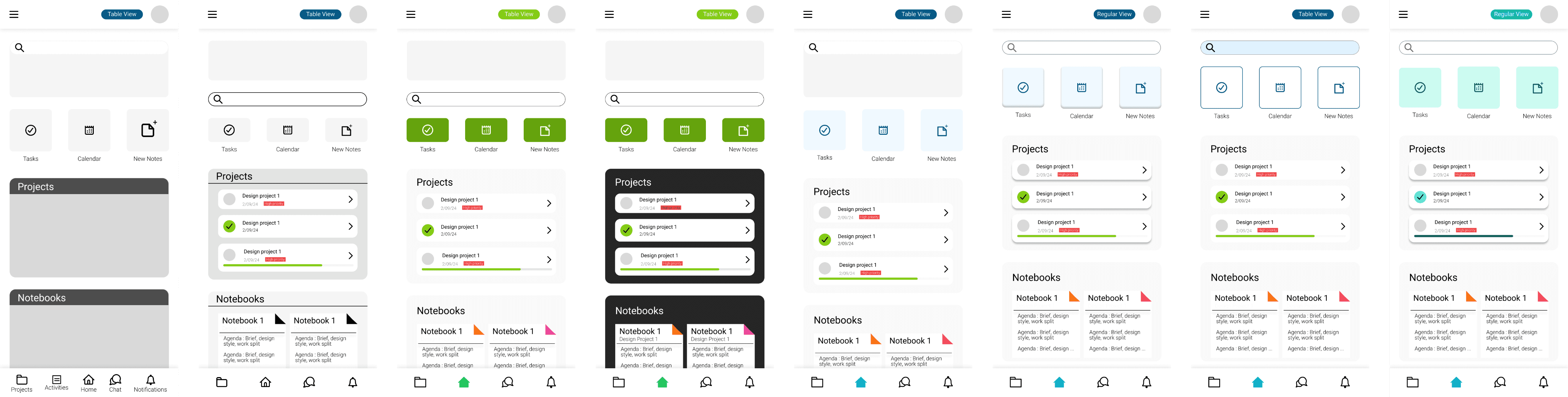
Redesigns are never straight forward. It’s easy to create a new system, but difficult to create a new face for an existing one.Throughout this process I focused on ensuring that the users needs were being met. In some cases this meant creating a completely new format, like the option for the mode toggle between the “Regular” and “Table” view. In others in meant sticking to what users were used to in things like iconography, notebooks, and timelines. The challenge came in when I wanted to try making the design more light and fun, for an app meant to boost productivity and work flow. Hence came in the “swipe on your task stack” function!
With this project came an understanding of how the basics of designing an app works, moving beyond function, towards functionality and aesthetics.
What if we could make work more interactive, incentive oriented, and maybe even gamified?
Could the task stack transform from a swipe function to a system where users would “level up” with every task successfully completed? What effects would this have on the users work ethic, and ability to complete and maybe even take up more work in lesser time periods? Would this add to or deter the work flow?